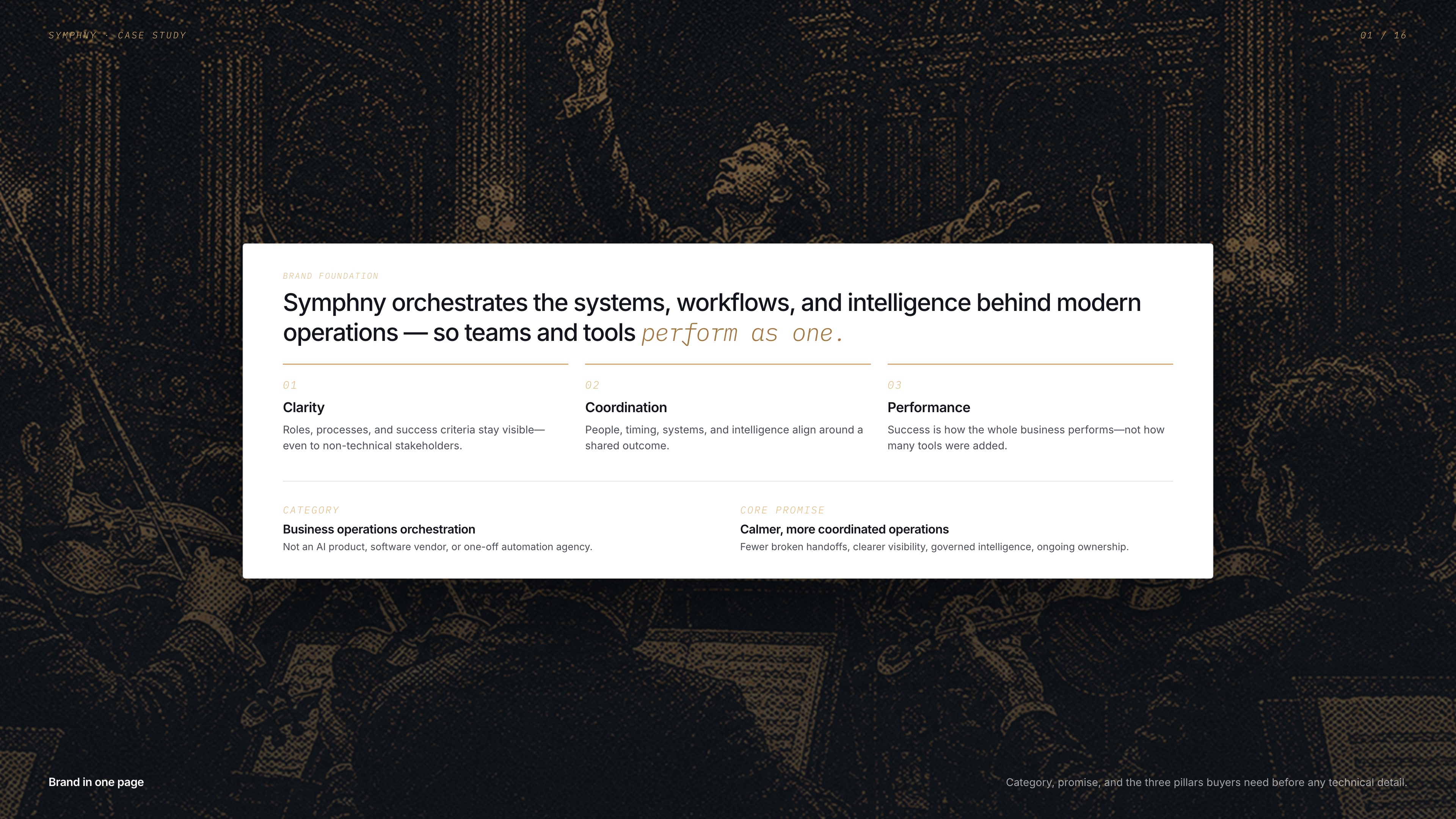
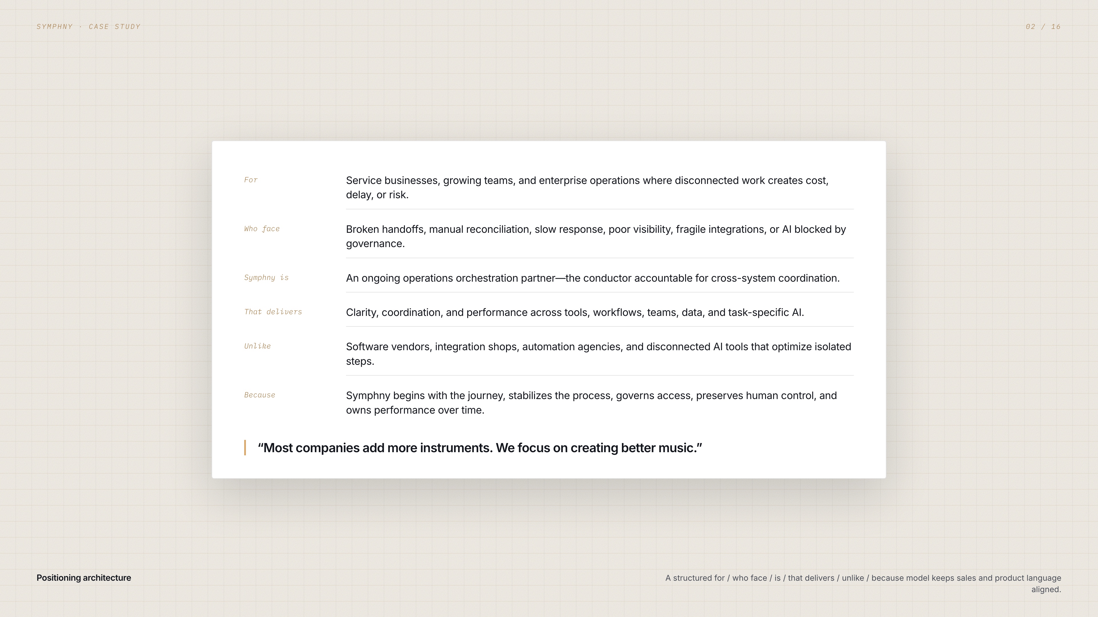
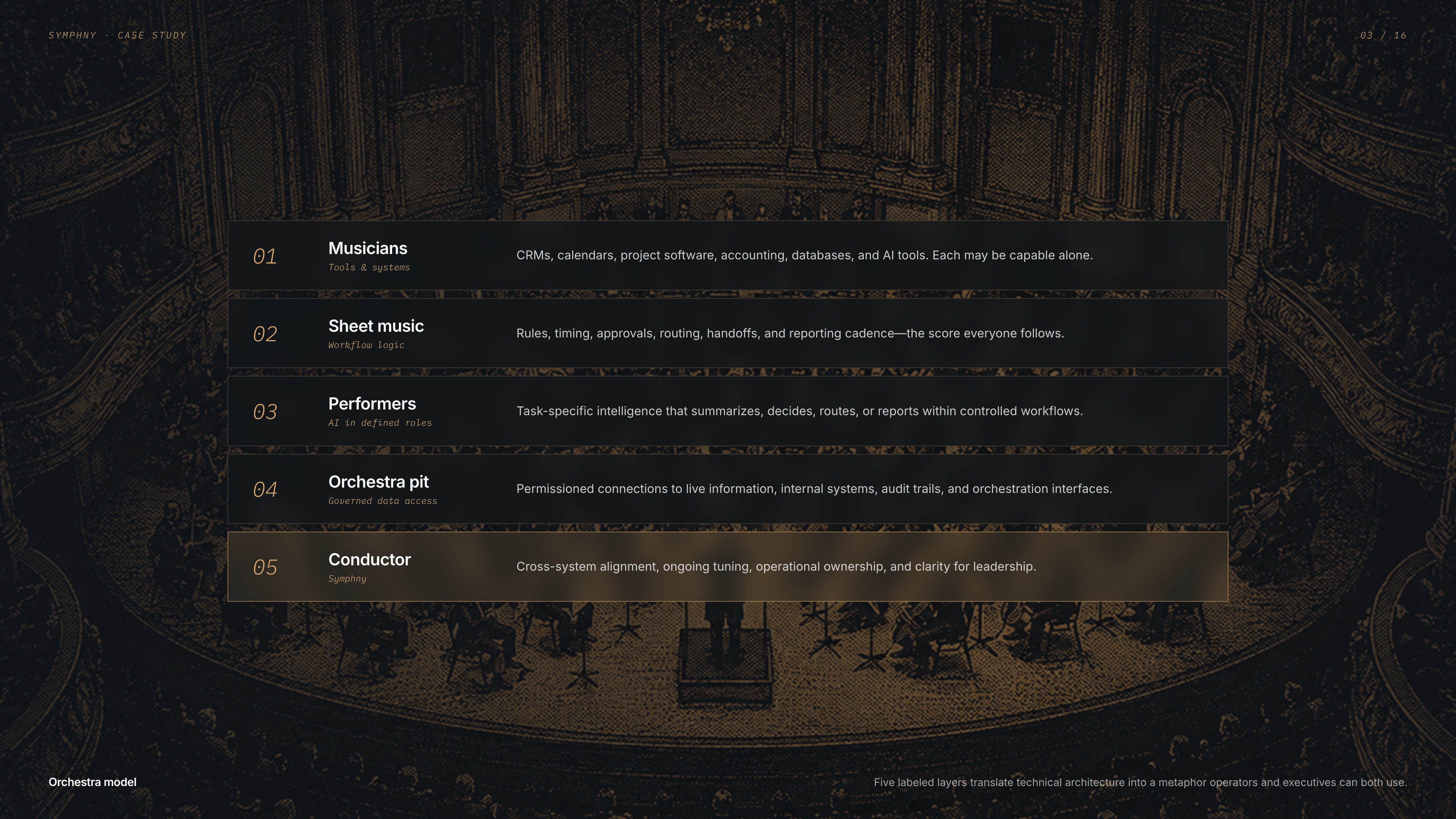
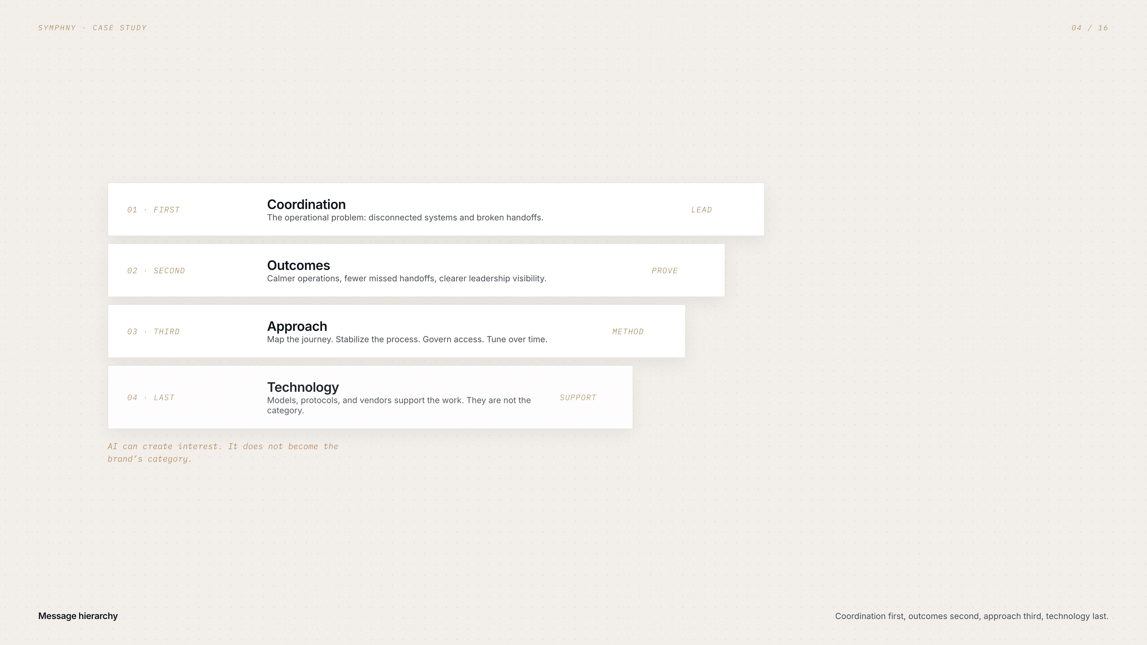
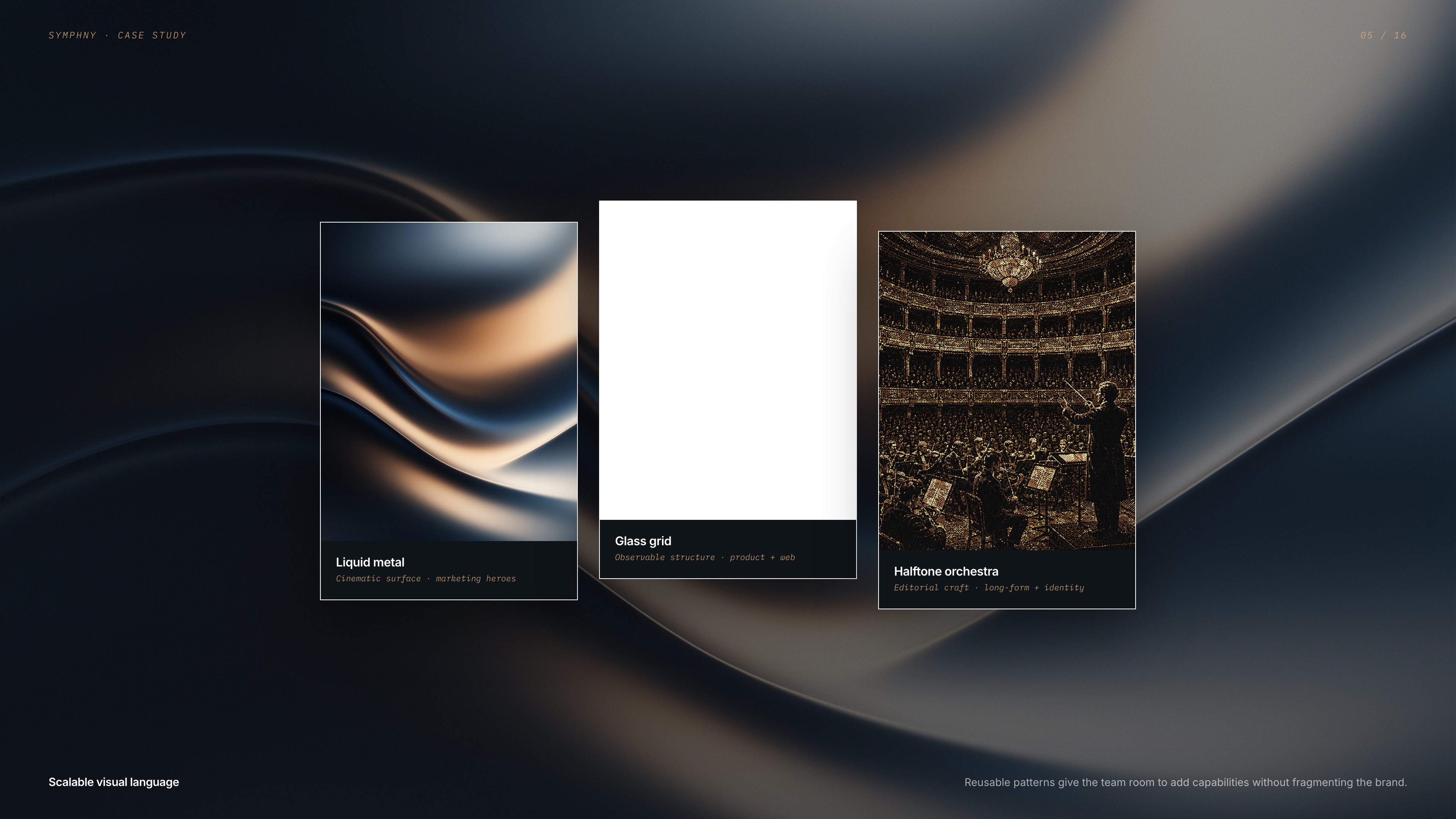
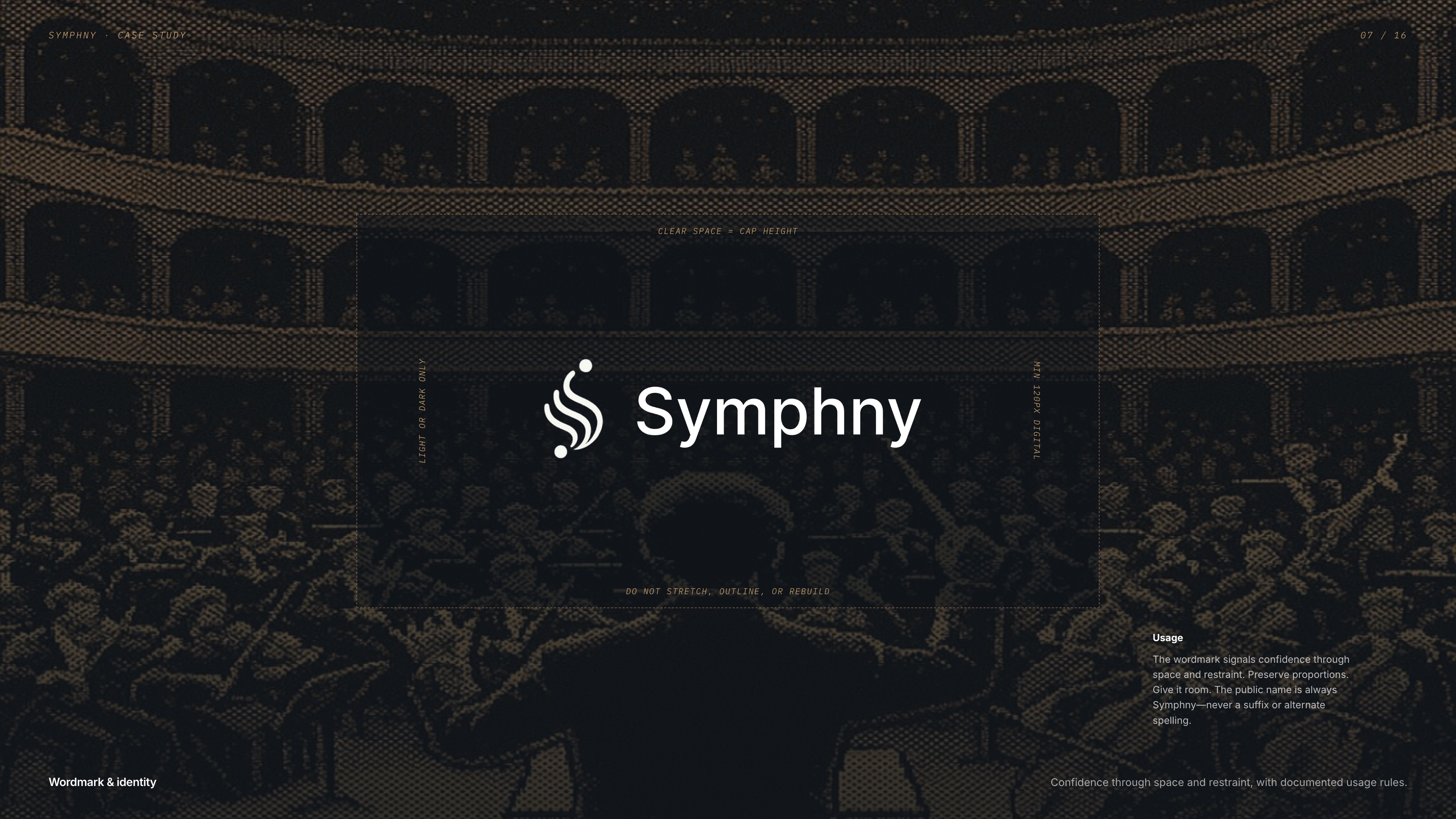
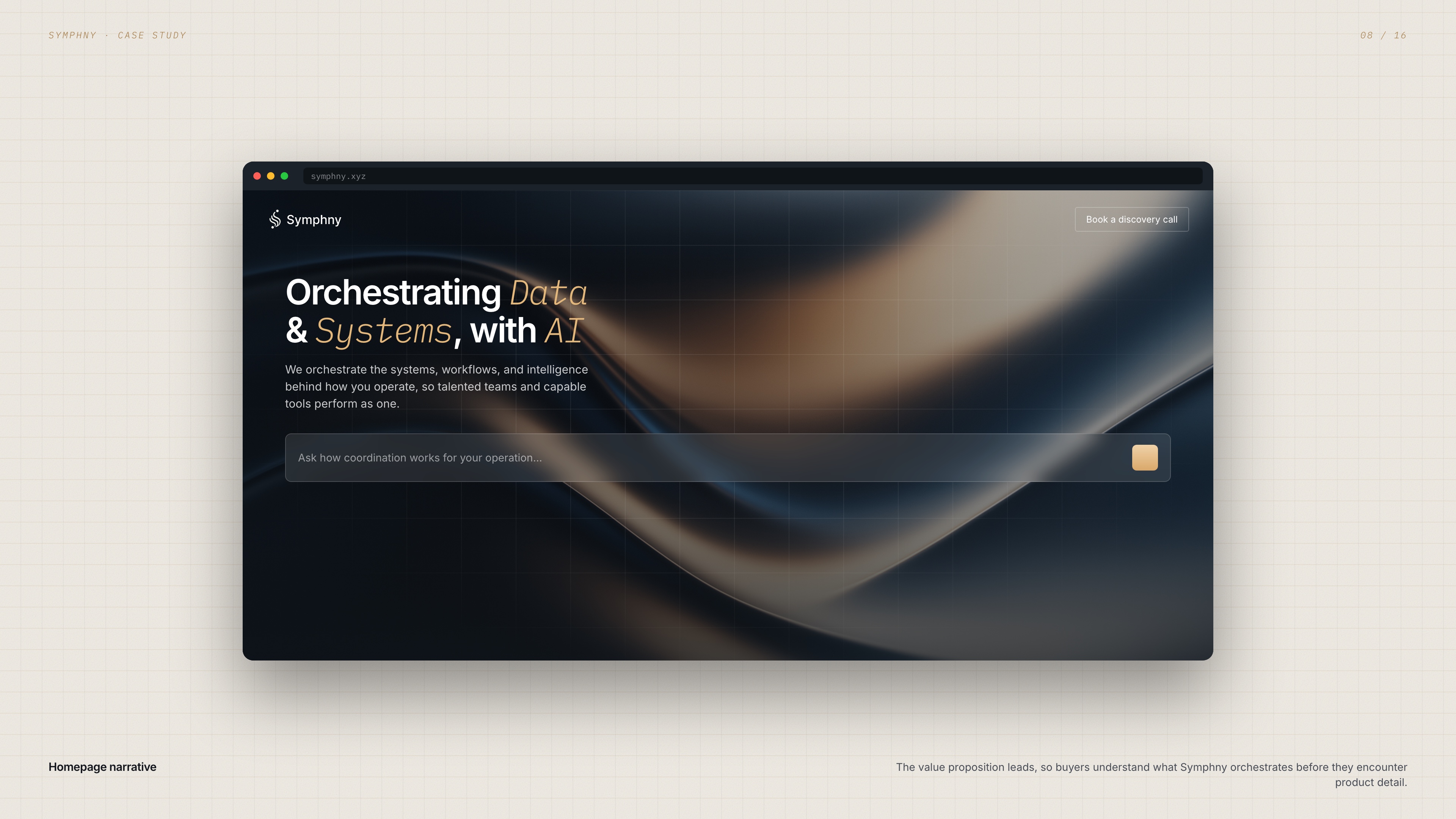
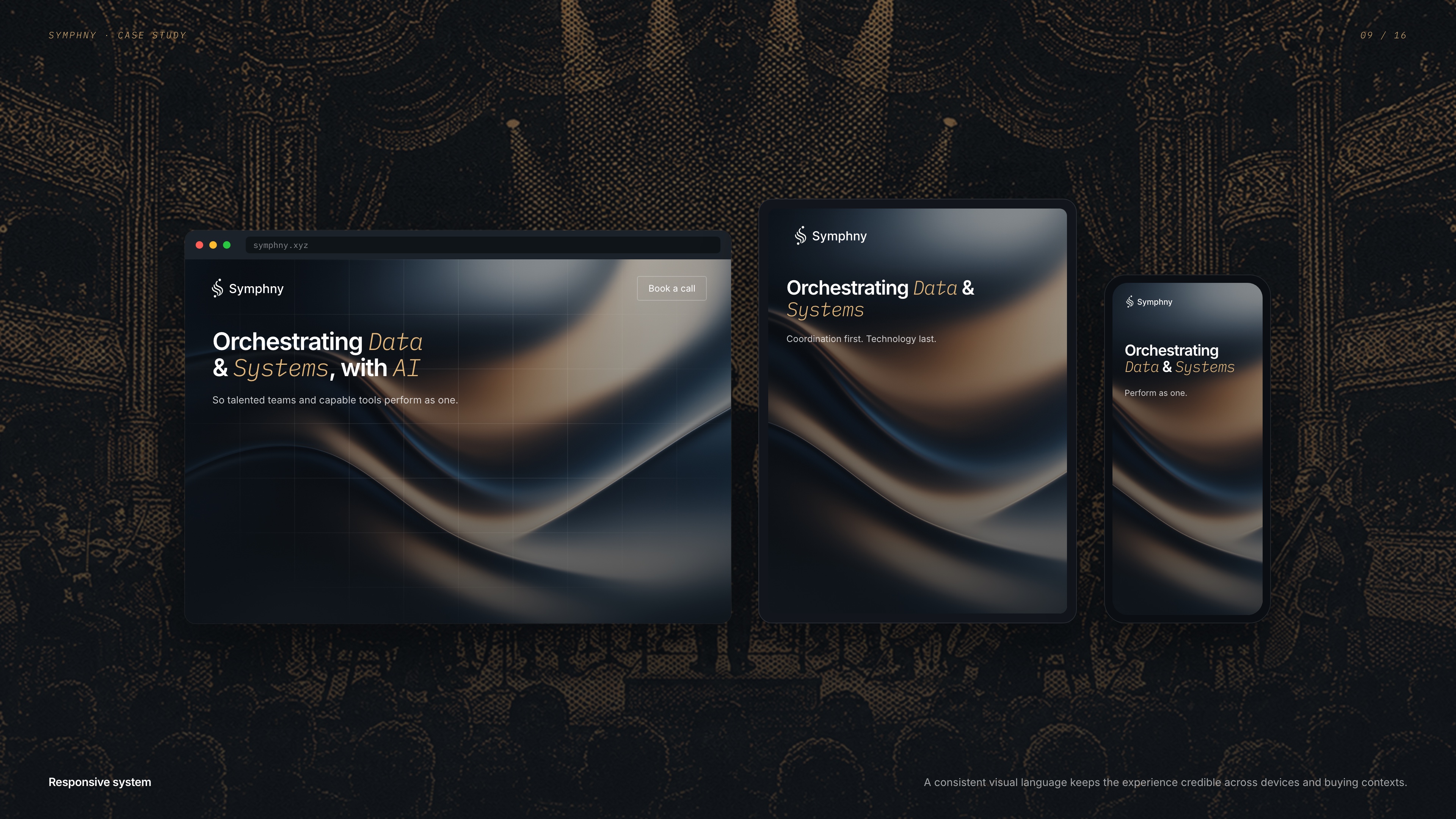
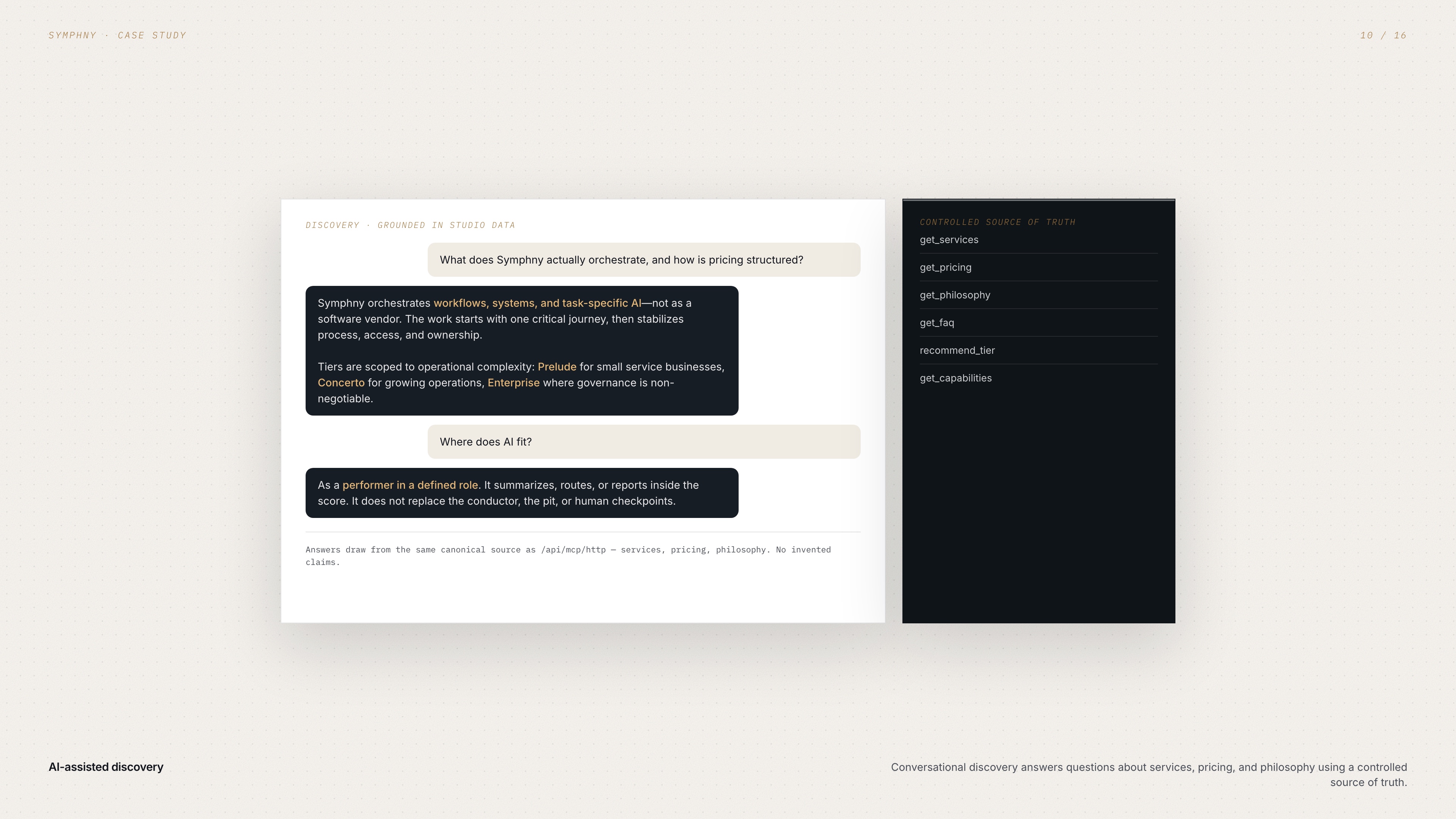
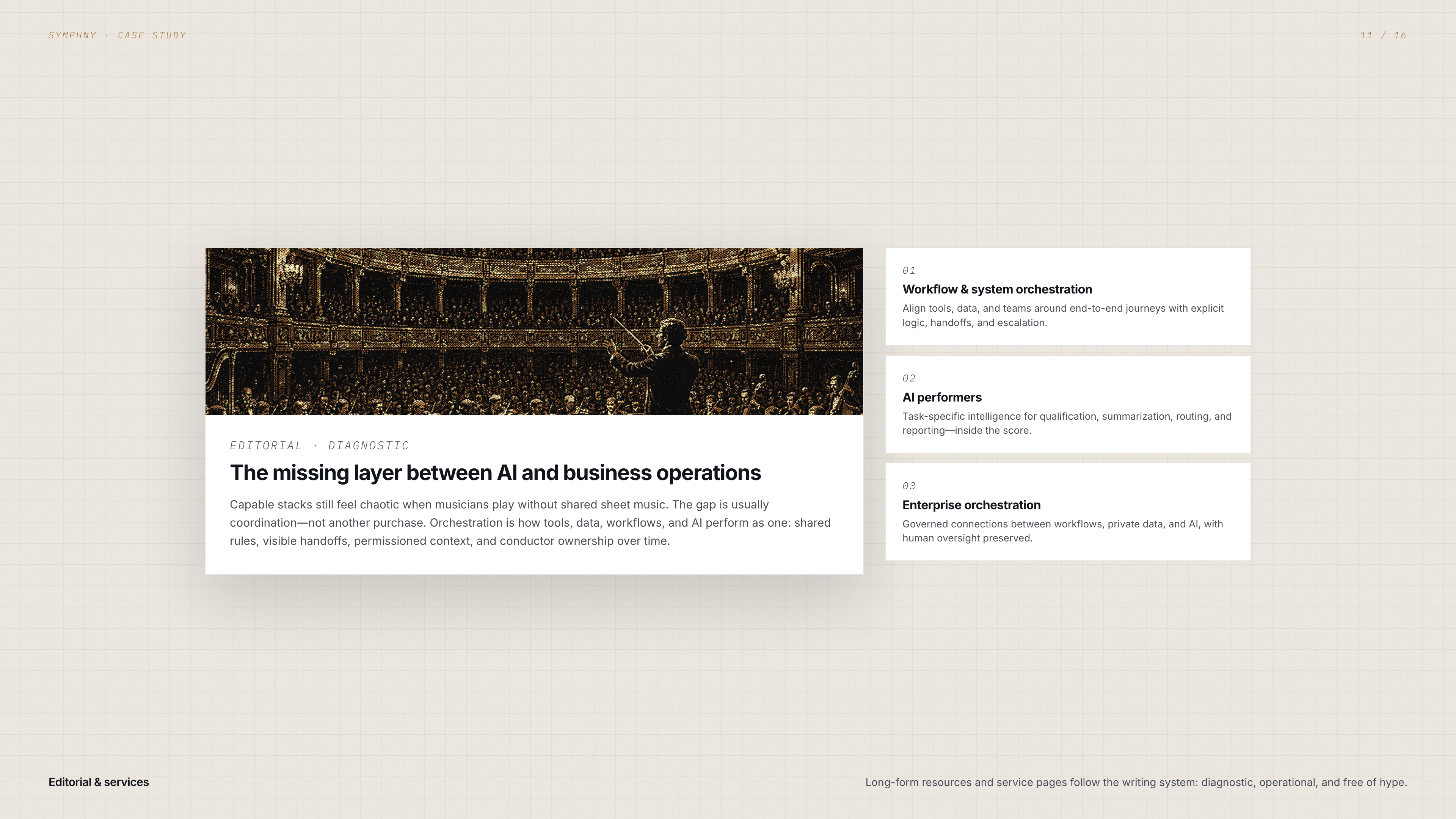
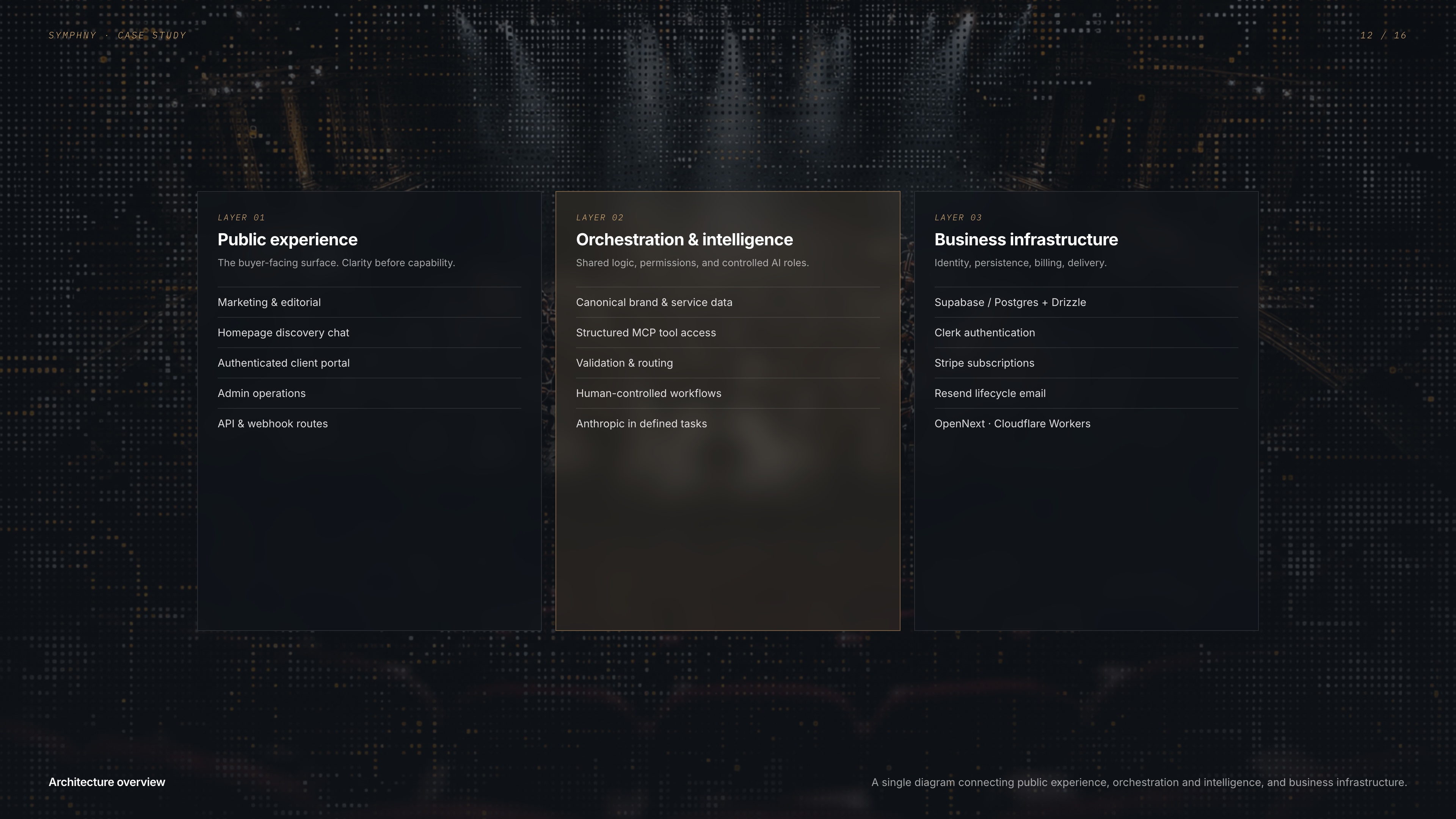
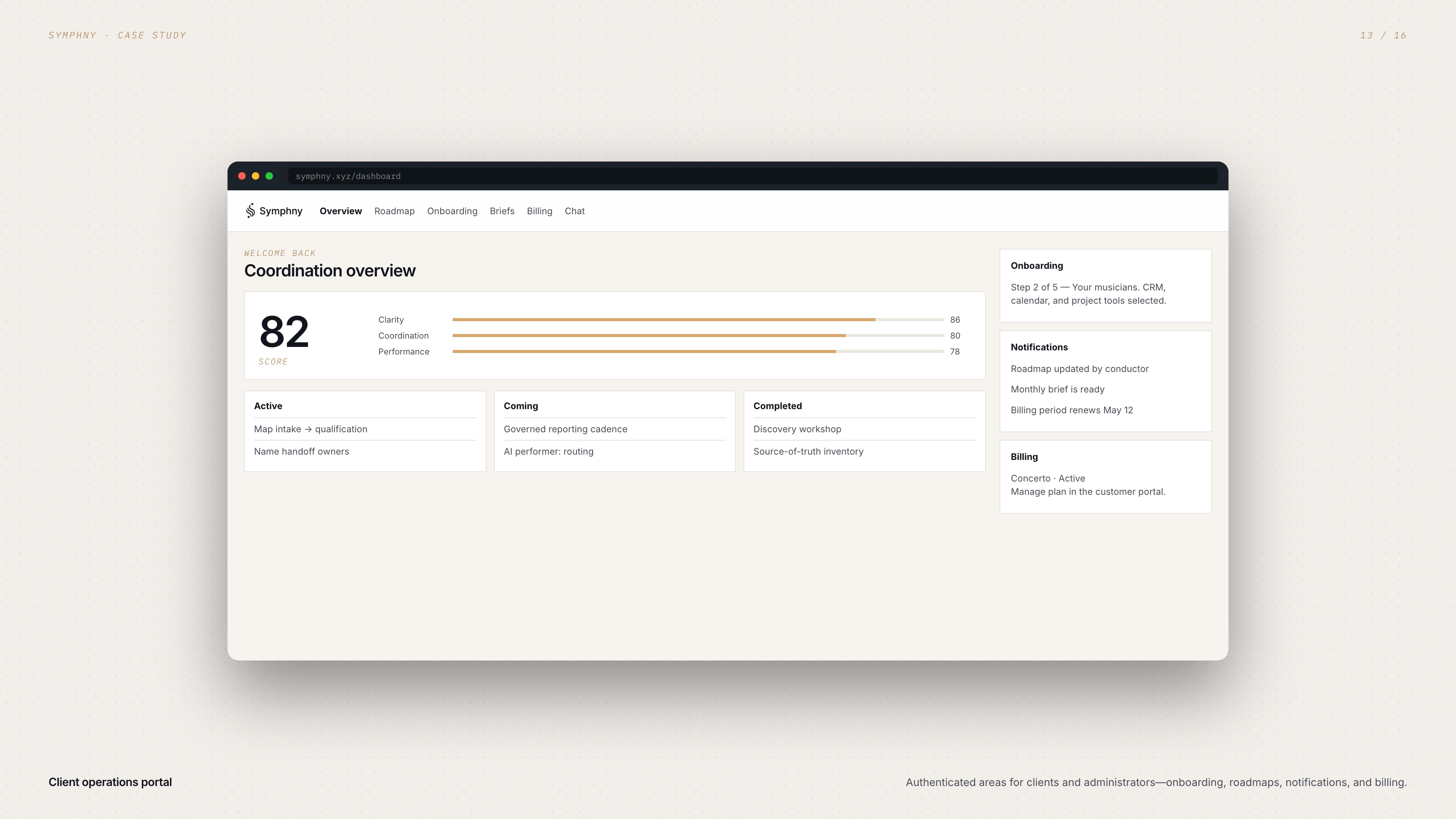
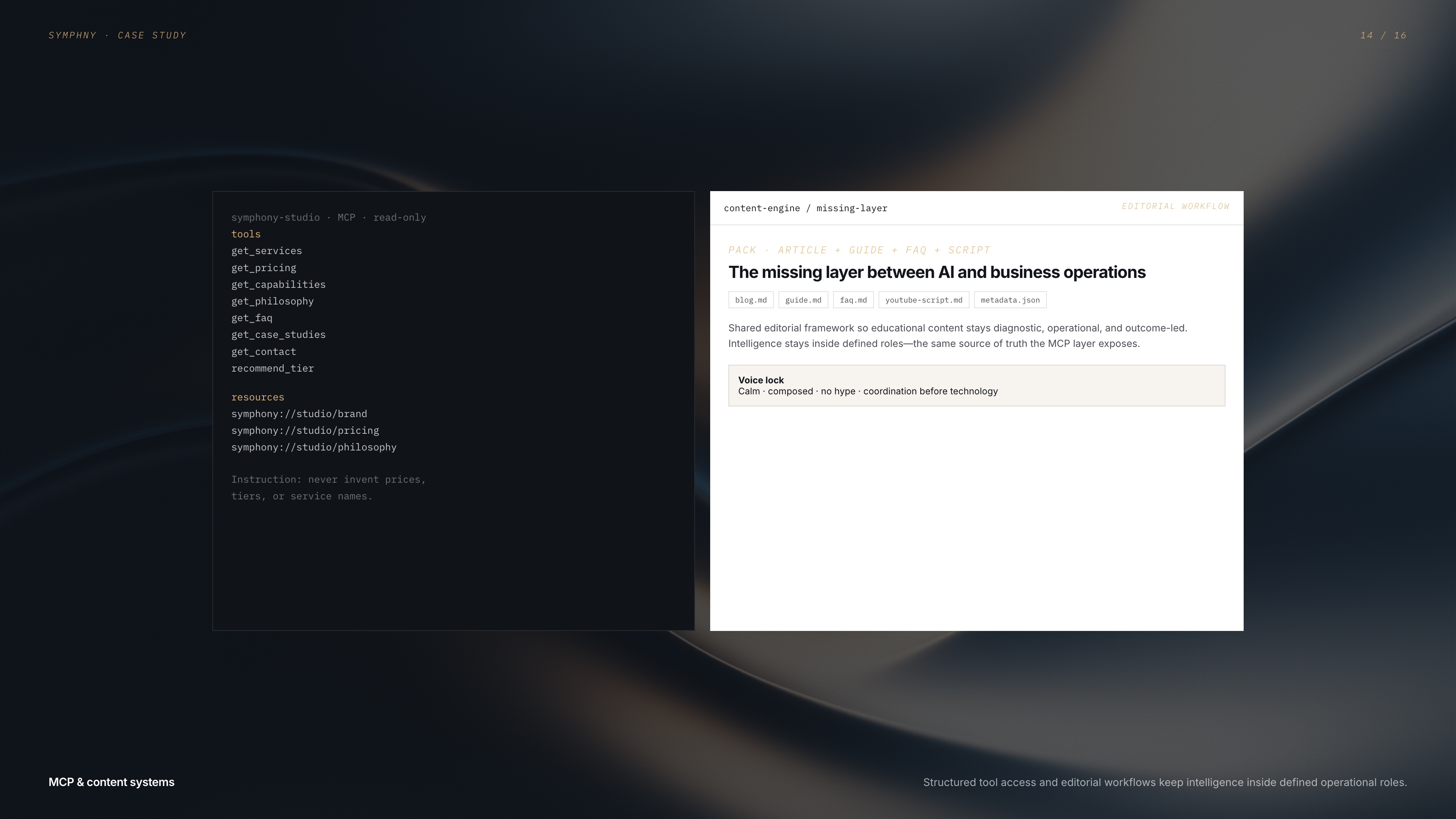
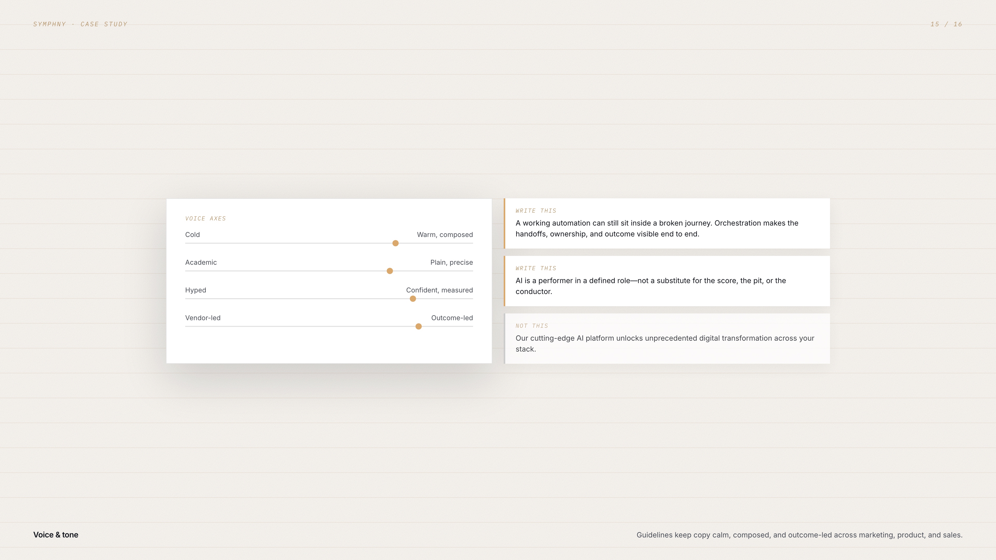
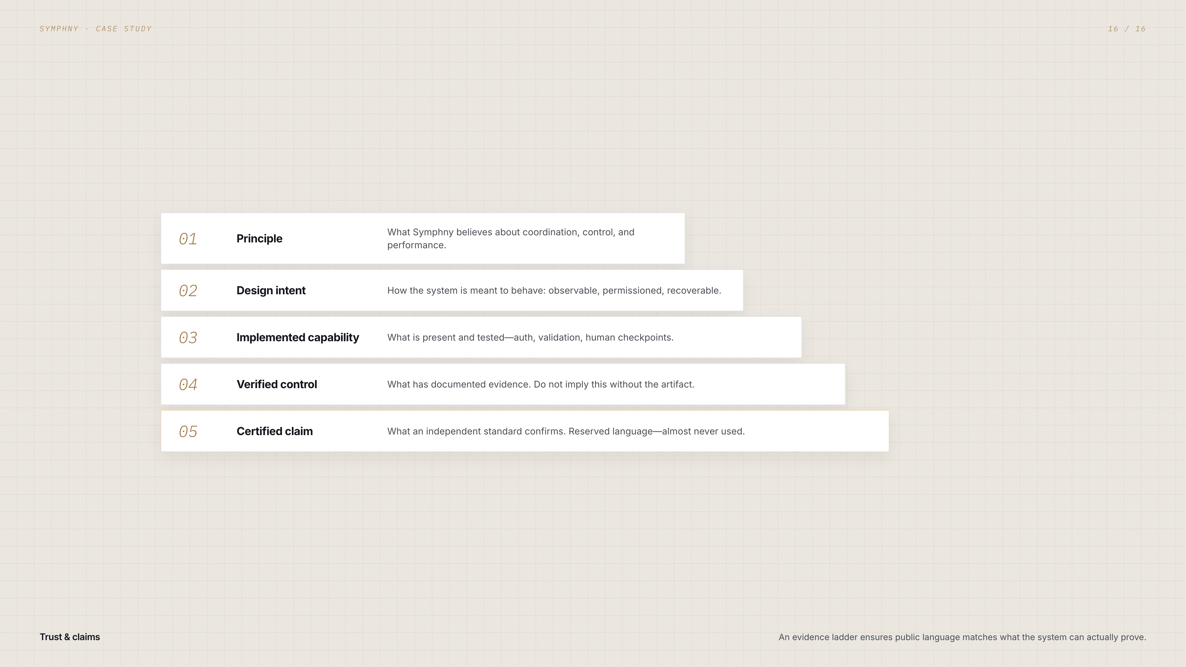
The visual identity translates orchestration into a restrained digital system. Dark structure, warm paper, and controlled gold accents create a premium feel that is calm—not ornamental.
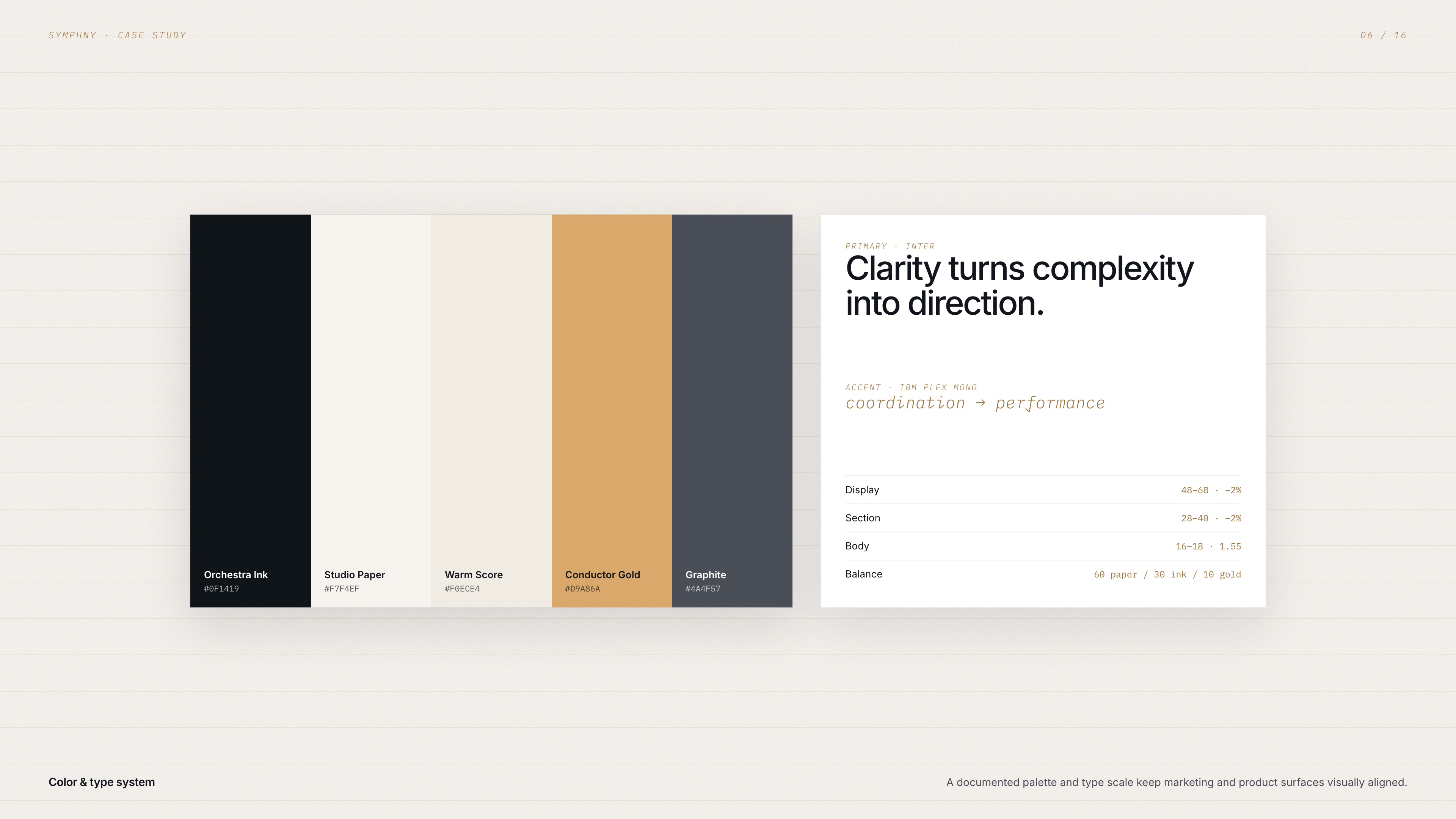
Palette: Orchestra Ink (#0F1419), Studio Paper (#F7F4EF), Warm Score (#F0ECE4), Conductor Gold (#D9A86A), and Graphite (#4A4F57)—balanced roughly 60% paper, 30% ink and graphite, 10% gold accents.
Typography: Inter for headlines, body, and interface clarity; IBM Plex Mono for eyebrow labels, layer names, technical details, and the conceptual words that carry the system. Geist Sans and Geist Mono support product interfaces where needed.
Imagery & motion: Orchestras, conductors, sheet music, architectural scale, halftone engraving, glass, and liquid metal—never robots, neon AI chips, or purple gradients. Motion favors slow drift, controlled reveals, and subtle shimmer rather than noisy effects. Interfaces feel observable and controlled: explicit status, ownership, next action, and error recovery.